Scale and Grow
ASICS Runkeeper App
Workshop
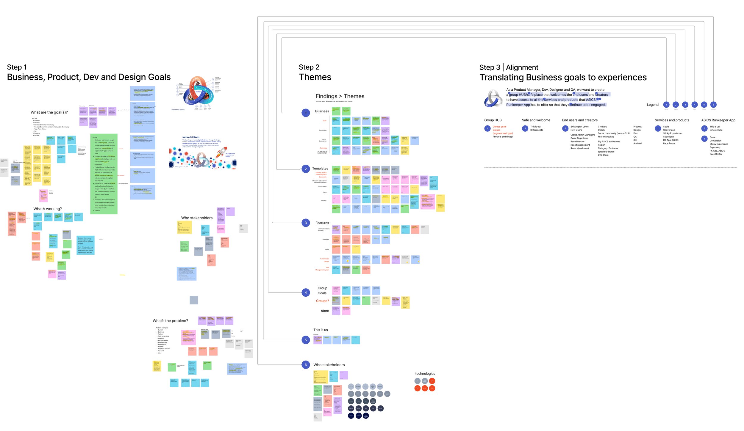
I conducted a workshop with all the stakeholders to share their inputs on Clara Henry's Group to discuss the areas of improvement and opportunities for the 'Group' next release —all stakeholders' inputs matter so that there is alignment on the problem(s) we need to solve.
Stakeholders that attended the workshop
Product
Director of Product Manager
Community | Senior Product Manager
Challenges | Senior Product Manager
Development
Principal Application Architect
iOS Developer
Android Developer
QA
Design
Principal UX Architect
UX Manager
Community | Senior Designer
Step 1
Business, Product, Dev and Design Goals and Pain Points
The Clara Group Project happened so quickly that we wanted to hear what the team was thinking and understanding of a new user segment, the 'Creator.'
A creator is a B2B user segment that provides their products or services to the athletes.
An athlete is a B2C user segment that participates in any activity in the ASICS Runkeeper App.
-
Asked the team what are the goals for the:
Business
Product
Product Owner for Community
Product Owner that wants their product or service featured in the Community Group Screen
Tech Point of View
QA
Designer
Others?
-
I had the team fill in their sticky notes on what's working, from processes, discovery, creation, and development to production.
-
I had the team fill in sticky notes on what was not working for themselves, the team, process, product or service.
-
B2B : Creaators
Coaches
ASICS Front runners
Influencers
Ambassadors
ASICS Community Stores
Social Community leaders (e.g. We Run 313, FEAR Milwaukee)
Event organizers
DTC Stores
Run Specialty Stores
Big ASICS activations driven by Region/Category Businesses
B2C : Athletes
Anyone who moves from walking, hiking, running, swimming, cycling, meditating, etc,
Training
Racing
Joining groups, events and challenges
Step 2
Grouped keywords into themes
All the stickies had keywords; I highlighted them on each sticky note and grouped them into themes.
-
Business themes:
Scale
Conversion
Sticky Experience
Superloop
RK App, ASICS, Race Roster
-
Template themes:
Anatomy of each card/component
Data points
Standard iOS/Android, pattern and behaviours
Components
Clara (Influencer
Process
-
Feature themes:
Leverage existing features
Challenges
Event
Customizable
Editable
Web
Management system
-
Group themes:
Group
Group goals
In-store groups
Create a group vs Groups
-
“This is us’ theme:
Differentiate
-
Internal | Employees
Product
Design
Dev
QA
Marketing
Race Roster
ASICS as a whole
etc
B2B: Creators
Coaches
ASICS Front runners
Influencers
Ambassadors
ASICS Community Stores
Social Community leaders (e.g. We Run 313, FEAR Milwaukee)
Event organizers
DTC Stores
Run Specialty Stores
Big ASICS activations driven by Region/Category Businesses
B2C: Athletes
Anyone who moves from walking, hiking, running, swimming, cycling, meditating, etc,
Training
Racing
Joining groups, events and challenges
Step 3
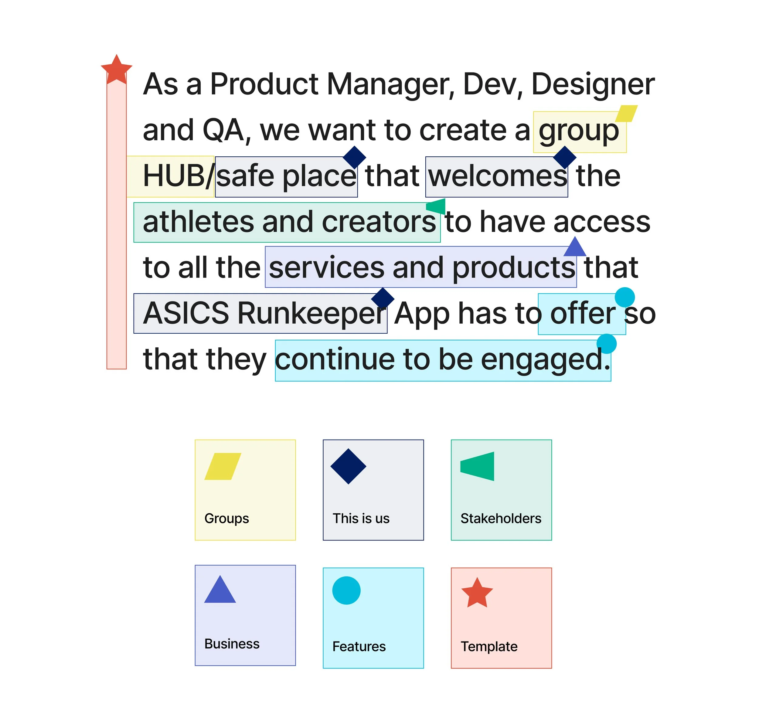
Alignment | Translating Business goals to experiences
I summarized the business, product, development, and design goals/pain points from the highlighted keywords and themes on the sticky notes to solve problems and find solutions for the business to grow and have the best experience in the Community workstream.
Below is an image of the Figma Jam board that the team used during the workshop.


11 taps / 7 screens
to view sub-category products
Please…I just want yoga pants.

Purchase flow
The journey ends quickly.

Analyze web navigation

The web data is shared with the lululemon app and I wanted to analyze the web navigation.
In-store observation

What’s new
New items are displayed at the front of the store
Scannable
Able to quickly scan categories by groups
Discounts
At glance, no discounts viewable
Educator(s)
Welcoming
Approachable
”What are you looking for”
Guest(s)
Hears the voice of an educator
guidance readily available
All items are at their finger tips
Vision
Have the same in-store experience to digital in-store experience. Omni experience will feel seamless

In-store/online shopping journey

Aha, moment… 1 hanger away - 1 tap away
Competitors
Nike
Madewell
Best Buy
Walmart
Adidas
Oysho
Indigo
Home Depot
Puma
Aritzia
REI
La Senza
MEC
Amazon
JCrew
Target
Sources
lululemon brand
lululemon guidelines
iOS (HIG)
Android (Material design)
Baymard
Nielsen Norman Group
Dribble
Summary of findings and recommendations
Capture screenshots: current state
Finding: Browsing is confusing and difficult,
Recommendation: Gather all the data points.
User flow
Finding: The journey ends quickly. The guest is not able to get to categories.
Recommendation: Review competitors and sources.
Analyze web navigation
Finding: Categories are mixed with the main nav and category list, which makes it difficult to scan and causes confusion.
Recommendation: Group data points - by gender, category, and collection.
In-store observation
Finding: Understand the store layout. Hear the voice of an educator and guest.
Recommendation: Have the digital experience be the same as the in-store experience.
Guest shopping journey
Finding: A product is only “1 hanger away” to a fitting room.
Recommendation: Have a product 1 tap away to a category screen.
Competitive analysis
Finding: Compare commonalities, interactions and patterns.
Recommendation: Keep the commonalities, interactions and patterns that work for the lululemon brand and app.
iOS / Android patterns
Finding: The android app uses the iOS interaction and pattern behaviours.
Recommendation: Have different designs for iOS and Android.
Review with the team
Findings: Share findings with the team.
Recommendations: Create a wireframe/mockup with recommendations.
Next step
Once I get the thumbs up from the PM. I start designing high-fidelity mocks.
Data points

Group commonalities.
The solution architect, iOS, Android developers, QA and PM were involved to provide their insights from the findings and recommendations. I also, wanted to make sure the data points were right. So, that I can start on my design.
(1) Gender tab; (2) What’s new; (3) Categories; (4) Activities / Collections; (5) We made too much
1, 2 and 3 is the whole store inventory
at the tip of your fingers
Wireframe with data points


Product design solutions

Android

iOS
In-store experience to digital experience
The entire store inventory is scannable with seconds.
At the tip of your fingers the guest can browse or start shopping
Ease of use
Combined 7 screens to 1 screen to select a category
Removed 11 taps to 1 tap away to a category
Scalable
Card components scales from B2C to B2B apps
NO MORE masking images
Flexible
Components are customizable
Able to create variants
Optional: image
Optional: loopable video 6-11 seconds
Reusable
Code
Able to use the components in different features
Performance metrics
Task success
The most widely used performance metric. It measures how effectively users are able to complete a given set of tasks.
Time on task
A common performance metric that measures how much time is required to complete a task.
Errors
Reflect the mistakes made during a task. Errors can be useful in pointing out particularly confusing or misleading parts of an interface.
Effeciency
Can be assessed by examining the amount of effort a user expends to complete a task, such as the number of clicks in a website or the number of button presses on a mobile phone.
Learnability
A way to measure how performance improves or fails to improve over time.
2018
$105 M
0.59M MAU

2019 RE-SKIN: Lululemon brand changed their colours from gold to red highlights, black text and white background.
$160 M
0.82M MAU

2020 New brand guidelines and a new category UX/UI interaction
$320 M
1.32M MAU
App & web comparison case study 2020
Goal
To gather feedback from Guests that use APP primarily on the web experience and Guest that primarily use Web on the APP Experience.
Having the Guests complete simpler tasks and answer similar questions to better understand what the differences are and how they are perceived.


App & web comparison case study 2020
Overall
Web-users were more impressed with the APP and stated that they could be more tempted to use it in the future. While the majority of APP users that went through the Web experience stated that they would still primarily use the APP. The Web users felt that the APP was obvious a more tailored experience for mobile use, that the design created a more focused experience and that there was less clutter which made the experience as one participant stated, “more chill.”
The APP users did state that they do use the web sometimes, but infrequently. They did feel that the filters in the web were more robust and made finding a product easier and that the main menu had more of a story than the one on APP, but it was simpler to just click on the APP to begin their shopping experience and being automatically logged in.
Shop anywhere and anytime!


View more cases